The IR website is one of the most important tools in an issuer’s arsenal. IR Magazine talks to companies that have recently updated their websites to better serve the investment community
This article is now available to subscribers as an audio recording too – please see below the "At a glance" section for the playback option.
To paraphrase the famous proverb, investor relations websites are a window to the soul of a company. In an increasingly online world, they are also an integral part of reaching out to new investors and keeping current ones well informed.
The IR home pages of today have come a long way since those created toward the thin end of the dotcom boom: in an IR Magazine article from 1996, IROs were bemoaning the hard choice between including ‘glitzy’ artwork and keeping the page’s load time to under a minute.
Twenty years later, websites are a central pillar of an IR team’s toolkit. Data collected by Nasdaq Corporate Solutions reveals that more than 84 percent of potential investors visit a company’s IR website to conduct research before they invest. More than a quarter of shareholders visit investor relations websites at least daily, while 71 percent log on at least once a week.
Below, we pick out examples of recent changes made across design, video, social integration and functionality in the name of improving the flow of information from issuer to stakeholder.
Ferrovial: video diary
Keeping investors up to date on your company’s progress is challenging when you’re an infrastructure company with interests ranging from high-speed railway in California to Scottish airports and toll roads in Colombia. Spanish blue-chip Ferrovial has come up with a novel way to keep its shareholders informed about new projects and other news across the 15 countries it operates in: an online video series.
The company has started to regularly post short videos to its corporate website highlighting recent developments, featuring images and clips overlaid with text in English and Spanish. The March edition notes new contracts to maintain highways and local services in the UK, a services agreement with Airbus in Spain, and plans for a social investing project across six countries, among other items.

Each piece of news has a related press release, so investors can read more if a specific topic piques their interest. In addition, any interested stakeholder can sign up to receive the videos by email. ‘Time is really the scarce recourse for people, so we are trying to provide information in a very agile format through new tools,’ says Ricardo Jiménez, director of IR at the company.
The videos always make reference to innovation – for example, the recent renewal of a research partnership with MIT – because ‘we think innovation will establish winners and losers in the mid-term,’ says Jiménez.
Salesforce.com: seamlessly integrating social
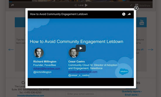
When cloud computing firm Salesforce.com redesigned its new investor website, it wanted it to have the same look and feel as the company’s new corporate website, while at the same time integrating its use of social and multimedia channels. Salesforce is very active across Facebook, YouTube and Twitter, live-tweeting earnings calls on the microblogging site, for example.
Rather than simply post across various channels, however, Salesforce’s site gathers posts from all over social media into a single ‘social stream’, integrated into every investor page. According to director of investor relations Andrew Zilli, who oversaw the new site’s development, it serves the dual purpose of alerting users to social channels they would not normally be aware of as well as enriching text-heavy releases.

The same thinking lies behind the technology that allows linked videos to open seamlessly in a pop-up window, so users do not lose sight of the important information they came to find in the first place. ‘We didn’t want to have to direct users to different channels,’ Zilli explains. ‘Rather, we wanted to pull all [those channels] together here so [users] can see everything in one spot.’
The move has sat well with Salesforce’s stakeholders. They like the site so much, in fact, that Salesforce picked up an IR Magazine Award for best use of technology & social media this year. ‘It’s definitely the most tech-savvy of my companies,’ says one sell-sider quoted in the IR Magazine Investor Perception Study – US 2016.
|
Security check-up • Ensure all non-public communications are encrypted. Whenever possible, send all information related to any future website posting via an encrypted means of communication. In most cases, this means you should avoid emailing sensitive information or non-public documents. • Use technical means to limit and monitor the audience. Before information is made public, it should be accessible on a strictly need-to-know basis. Your website’s content management system (CMS) should be password-protected, with unique accounts for each user, varying levels of access, and detailed access and change logs. • Employ a secure staging environment. When prepping an update to go live, the environment used to stage your preparations should be kept strictly confidential. ‘Security through obscurity’ via a tough-to-guess URL is not sufficient; the staging environment must be strictly password-protected and locked down to a select group of users. • Enforce strict document embargoes. Your CMS should be designed to ensure no amount of human error can allow a document to become public before the proper time and date. • Randomize your file names. When posting documents to a public area, never give them logically guessable file names. If your prior quarter’s earnings supplemental was titled ‘CompanyX-1Q16Supplemental.PDF’, then any sufficiently intelligent web crawler will be able to guess the file name of the second quarter document if it is sequentially named. |
General Electric: responding to feedback
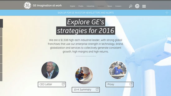
‘Websites are not always straightforward for investors,’ says Dan Huber, senior IR manager at General Electric, discussing his firm’s website upgrade project. ‘We always thought hard about their feedback and looked at the website from their perspective.’ Under the new design, the most important and well-read parts of the website – the latest letter from CEO Jeff Immelt or the recently redesigned 10K, for example – are given top billing.
The innovations are not just about the design, though – they also address the design process. While making changes, GE used a new system that allows it to respond to investor feedback as it goes along.

Newly designed pages of the site are launched one at a time, with user feedback gathered and content added on the go. ‘It’s a smart approach that means we can take all the learning from this first site and apply it to other pages,’ Huber explains. ‘The old way would have seen us spend several months to a year redesigning all of our pages and then hoping they met investor expectations. The new approach allows us to release a new page in less than a month and then collect investor feedback before designing the remaining pages.’
Initial feedback has been good, illustrated by GE’s IR team finishing third in the best use of technology & social media category at the IR Magazine Awards – US 2016. One member of the buy side describes the company’s new digital presence as providing ‘vast improvements to communications’ – a glowing review for the GE IR team.
Japan Foods Holding: visual impact
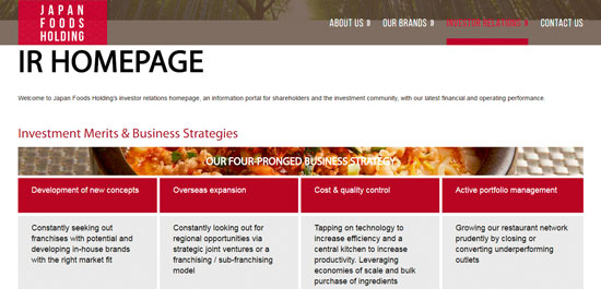
Japan Foods, a Singapore-listed restaurant chain, has bet on the use of big image and sophisticated animation combined with a clean, one-page scroll-down design to get ahead in the investor wooing race. Following a ‘cut through the clutter’ approach, the investment case is set out directly on the company’s main IR page, allowing investors and analysts to get an instant overview of the business model and its key selling points, with IR contact details – complete with a map background – posted immediately below it.

Navigation through the different IR content, which includes analyst coverage, a corporate governance overview and a list of the top 20 shareholders, is made easy by a sticky menu at the top of the page. The site’s ‘click less, scroll more’ concept creates a modern look and also provides a handier user experience for mobile and tablet viewers, as does the flat color design, which helps to reduce unnecessary color gradients, 3D effects and shadows on smaller screens.
One of the site’s differentiating points is its use of ‘rich but subtle animation,’ says Marcus Sulzer, CEO of EQS Asia. On the home page, various flagship dishes are displayed with a paralax effect, and pulldown menus appear when viewers hover over a headline. The big image banners add an overall sense of clarity to the website’s look. ‘The use of big image on the home page gives investors and analysts a big visual impact, making it easier for them to understand the business and services provided by the company,’ Sulzer explains.
|
Filtering through the Chinese firewall A firewall set up by the Chinese government checks both incoming and outgoing online information, which means websites hosted in mainland China with cross-border access are affected – and vice versa. ‘Companies have just started using responsive websites and many have very limited design requirements,’ explains Marcus Sulzer, CEO of EQS Asia. ‘One of the reasons is that it allows the information to easily get past the Chinese firewall.’ The filter screens every item on a website, such as teaser boxes, text blocks, pictures and tools. ‘The design itself will have an impact on the level of development and coding needed, when videos or photo galleries are featured, for example,’ Sulzer adds. ‘The more of those special items you use in a website, the longer the loading time and the higher the risk that certain content gets blocked.’ |
Britvic: customizable data
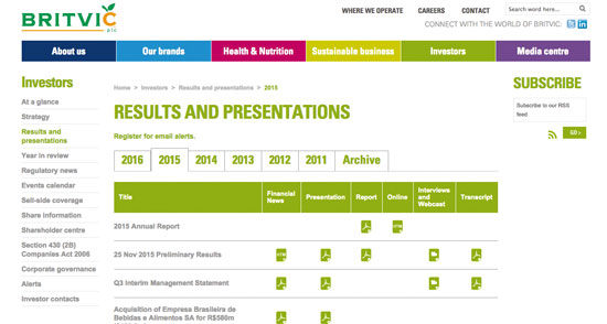
At UK beverages firm Britvic, the IR team has taken the step of not only providing detailed data through its investor site, but also making it exportable and manipulable by any visitor. This means analysts are free to use the figures in their own models or programs or to use Britvic’s online tools to get a far quicker and wider view of the company, notes Adrian Meredith, head of global marketing at website specialist Investis.

Britvic’s data currently stretches back to 2011, with updated charts added every year. The information available includes profit and loss charts split by business division and country, a detailed cash-flow breakdown and a full balance sheet. Any statistic from these sections can be compared with any other figure with a quick click, before being published instantly via an online charting tool or exported for later digestion via Excel.
This article appeared in the summer 2016 issue of IR Magazine

