We asked digital experts to review their favorite IR sites. The only rule: they couldn’t pick one of their own clients
Subject: Microsoft
Reviewer: Bradley Scott, senior product manager, SNL Financial
It’s rare when a corporate website provides everything an investor might need to fully evaluate a company’s financial performance, and rarer still when that content is provided in a form that fully uses the platform on which it is presented. Microsoft, however, does both – in spades. 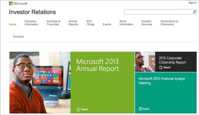
Bright start: Microsoft’s IR home page makes use of colorful tiles to highlight key content
Generally I look for three things when considering the effectiveness of a company’s website as a disclosure channel:
- Is the information available in a timely manner, and is it updated regularly?
- Is the information easy to find and clearly labeled?
- Is the information presented in a format that is easy to understand and digest?
When you first land on Microsoft’s IR home page, you’re greeted with bold, colorful graphics highlighting timely information – for example, its most recent quarterly earnings content. In looking at aggregated analytics for the nearly 700 IR websites we host, we know earnings materials are the biggest traffic generators on a quarterly basis, so it’s no surprise these would be front and center as soon as you land on the site.
While timeliness and accessibility of information are critical, the format and presentation of materials are not all created equal, and this is where Microsoft excels. Clicking through to its quarterly earnings landing page, you are presented with a wealth of information in a multitude of formats. Investors get one-click access to standard items like the webcast, earnings call slides, transcript, financial statements in Excel, and so on, but the real differentiation comes via the tabs at the top of the page, where investors can access detailed financial results and integrated charting.
While most professional investors gravitate toward subscription tools like Bloomberg, SNL or CapIQ, retail shareholders are generally left to third-party data from Yahoo! Finance or their online brokerages to perform analysis. Rather than send these investors away from its website, Microsoft provides these tools publicly, for free, bringing traffic back to its site and allowing it to control its message.
Granted, Microsoft is a mega-cap company, with the resources that go along with that, but the commitment it makes to disclosure on its website and the sheer amount of information it makes available in a very digestible way (by using charts and a functionality that caters directly to its audience on the web) make it the gold standard when it comes to online investor communications.
Subject: BP
Reviewer: Phil Marchant, managing director for UK, KW Digital
BP.com has a long and proud history of innovation in the corporate website world. I still remember the site venturing into personalization well before anyone had heard of Web 2.0, let alone understood what it meant.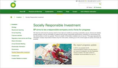
BP’s IR site receives praise for its dedicated section on SRI
The current iteration doesn’t disappoint. It effortlessly glides you through its content, telling a clear and vibrant story. It doesn’t make you do all the work and fit all the pieces together; it puts the message right in front of you and then backs it up with evidence. The design is simple but also very clean and functional, allowing the vast depth of content and engaging features to take center stage.
As you would expect, the IR section is packed full of information. But BP moves ahead of its peers by offering those extra touches – my favorite being a detailed strategy section that is clear, direct and coherent, yet also contains a full archive of past corporate strategy presentations so the investor can follow the whole story.
The section also offers a whole menu item dedicated to SRI. Aimed directly at socially responsible investors, it brings together in one place an excellent archive of investor briefings, management speeches, standards and practices, reports and key topics that have direct relevance for the ethical investor. The site certainly doesn’t fall into the trap of putting all of its sustainability information into one section and ignoring it for all other stakeholders.
Further evidence that the site works as hard as possible to make the visitor’s life easy is the number of analytical and share price tools, plus a most impressive news release section that divides and categorizes the huge amount of releases – and offers a dedicated search function that allows you to search by date range, topic or keyword.
Subject: adidas
Reviewer: Eric Johnson, director of strategic communications, The Works
I was recently at a meeting where a participant praised adidas’ IR. After checking out the IR section of the company’s website, I now understand what she meant. My friend from the meeting works for a leading retailer; she eats and sleeps brands, and adidas’ IR is all about the brand.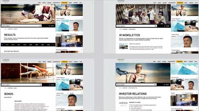
Adidas adds a sporting banner to each section of its IR site, reinforcing the link between its products and financial performance
On the landing page of the IR section of the site, you’ve got a pole-vaulter in mid-arc as a banner, a freakishly fit individual climbing a rope as a call-out for Q2 results and Derrick Rose driving to the net announcing the AGM. Clearly, this is a company ‘built upon a passion for sports and a sporting lifestyle’.
The commitment to the adidas brand extends throughout the site’s IR section: there’s a shot of something strenuous and inspiring on almost every page. This makes it visually engaging, a big step up from many IR sites. More importantly, it continually reinforces the connection between adidas products and brands and the company’s financial performance.
Amid the athletics, the site does not forget investors: there are many useful features, including a page dedicated to ‘Outlook, targets and investment case’, a downloadable ‘Group at a glance’ booklet and tools such as the interactive analyst, which enables users to measure the company’s performance over a 10-year span and then download that information into their spreadsheets. There’s even a total return calculator, so you can quickly see how much you’ve made – or could have made – from your adidas investment.
While the adidas IR section is a winner overall, I have to call one minor foul: ‘Share details’, the up-to-the-minute tracking of adidas’ stock performance, is at the bottom of the landing page. You can’t see it unless you scroll down. That’s odd placement because, of all companies, adidas should understand that players and fans want to know the score.
Home page in focusWhile the IR website is often the ultimate destination, investors and analysts usually hit the corporate home page first. Simon Harper, client strategy director at global3digital, picks a site that directs users to their desired content |
