Who actually reads your annual report, and what do they want from it?
The challenge when creating an annual report is working out how to make it all things for all people: investors and analysts have very different needs from those of the media or employees. It’s not a simple case of pointing different audiences to different sections of the report; the overall theme and tone of a report are seen as being increasingly important.
These days, an annual report must be cohesive and amount to more than the sum of its parts. It should communicate the personality and culture of a company, while reaching out to a wide variety of internal and external audiences. The question is: how do you tailor your report to engage with these very different stakeholders?
Step 1: Define your audience
‘Annual reports quickly become generic when they try to communicate with too many audiences at the same time,’ warns Andy Blankenburg, associate partner at VSA Partners. ‘Every annual report has investors as an audience, but investors are rarely ‘the’ strategic priority. I can remember a time, perhaps 10 years ago, when we had extensive discussions with some IR clients in which we geared the annual report to investors and segmented them in excruciating detail: buy-side and sell-side analysts, portfolio managers, executives of financial institutions, retail investors, and so on. That’s simply not an agenda for our clients now.’
Blankenburg explains that for employees, VSA might create an annual report that focuses on organizational change, culture, operational efficiency or shared vision. For customers, the report might focus on market trends, new capabilities or global reach; for investors, growth opportunities, strategic shifts, leadership strength or innovation. ‘Typically, the communications agenda – and thus the storytelling – crosses all of these audiences, but with one foremost in mind,’ Blankenburg comments. ‘The storytelling is never the same.’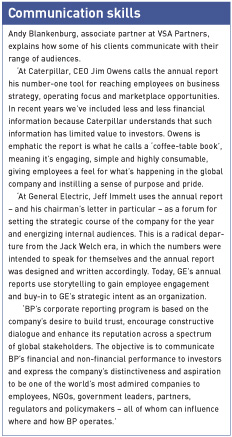
Step 2: Use different tones and techniques
‘We use the main idea to inspire the story, and then the sections – operations, letter, case studies and products/services – are written in slightly different tones, to create chapter-like areas,’ explains Rachel Elnar, partner at Ramp Creative. ‘We call it ‘pace-placing’. The result is a dramatic yet cohesive report that appeals to multiple audiences.’
‘You need to map a company’s strategic agenda for the report against audience needs and mindsets,’ advises Blankenburg. ‘From this foundation, context and design are developed in tandem, with choices made in terms of compelling messages, language, imagery, typography and, in the case of online reports, site architecture, interface, tools and media.
‘Post-Enron, post-SOX, we have a lot of discussions with clients about the tone and voice of the editorial section, including the CEO or chairman’s letter. Transparency is communicated through volume and accessibility of information, and voice has a lot to do with expressing openness.’
Robbie Jennings, vice president of Sanger & Eby Design, thinks similarly. ‘Language and a variety of visuals can convey different themes,’ he explains. ‘Layout, photography and typeface can all help to differentiate messages.’
‘Color, scale, paper selection and certain production methods can also be used to tailor messages and communicate select messages,’ adds Elnar.
Step 3: Add some personality
‘When employees are a key audience, a company might consider featuring real employees in the photographs rather than using models or stock photos,’ says Lawson Cox, general manager of graphic design firm see see eye. ‘A section in the report or sidebar stories could highlight employee accolades such as top sales performers or leaders from an internal safety training initiative.
‘When prospective customers are a key audience, testimonials from current customers are a good way to explain the company’s products and services. A Q&A format can add candor to a discussion with the CEO or a team of executives, and will seem much more personal to the reader than a more standard letter to shareholders.’
Step 4: Break up the text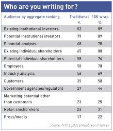 ‘To meet the needs of different audiences, we recommend providing the information in tiers,’ says Cox. ‘That way, people can skim headlines, subheads, lead paragraphs and captions to get the broad strokes of the message. When they see a topic that interests them, they can dive into the more detailed discussion.’
‘Captions and concise bullet points help the three-minute reader grasp the company’s depth and breadth,’ comments Jonathan Pite, owner and creative director of Pite Creative Services. ‘Photography, charts, graphs and illustrative graphics are worth a thousand words and better position a company through look and feel.’
‘If a company is commonly asked to provide certain financial operational statistics by analysts and others in the investment community, it makes sense to give prominence to these data in the annual report by using charts and tables,’ adds Cox. ‘It’s a good idea to use a caption that offers some kind of interpretation of the data.’
Step 5: Think about the big picture
‘Today, an annual report is an opportunity to proactively define who you are as a company, what you stand for and how you intend to optimally position yourself for meaningful dialogues with your stakeholders,’ explains Roxanne White, vice president at Baker Brand Communications. ‘That means companies need to convey and reinforce their key messages and express both the tangible and intangible aspects of their business.’
‘A well-written and well-designed annual report can meet the expectations of its multi-faceted audience by being true to the company’s mission and vision and detailing what makes the company unique,’ adds Pite.


