Design, tools and content in online annual reports continue to evolve at a fast pace
Ever since the first annual report appeared online, companies have been finding new ways to surprise and innovate.
This year has continued the trend, with the introduction of new tools as well as further improvements in the look and make-up of online reporting. Here are five ways in which online reporting is evolving.
1. Responsive design
One of the newest tools on the block is responsive design, which allows for the online annual report to adapt to any PC, smartphone or tablet. With the world becoming more reliant upon mobile devices, companies are working hard to keep up.
Businesses no longer have the worry of having to develop a secondary mobile-friendly report or risk the HTML nightmare of users viewing the regular website report on a tablet or smartphone.
Images, grids, graphs and text are flexible in nature, making for easy viewing from phones or computers. Responsive design has been used for a while in general web pages, but this is the first year it has played a major part in online annual reporting.
Nina Eisenman, president and creative director of Eisenman Associates, cites its ability to create a ‘more fluid’ report as one of its key selling points. It has led to the resurgence of long scrolling pages, which is becoming more common with the use of mobile devices. Some firms have added the interesting aspect of parallex scrolling, where content moves on different layers.
Grenville Hamlyn, user experience director at Addison, believes responsive design is ‘appropriate for summary-style communications’, such as that seen in KPN’s report. He points out, however, that Addison is ‘responsible about responsive design’ – currently there is not enough mobile traffic for it to be a standard tool.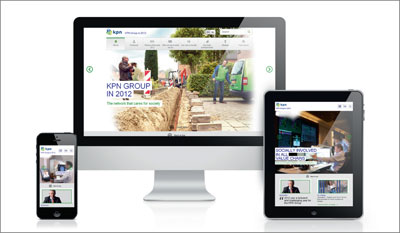
KPN takes the responsive-design approach
Indeed, not everyone is keen to implement this mobile-friendly approach into their design. Michelle Marks, head of creative and online strategy for Ideas On Purpose, even disputes its necessity.
She doubts the volume of mobile traffic is high enough to demand such a tool be used for reports, which have only a one-year life span, making it not ‘mission-critical’. Instead, client companies are encouraged to go for an iPad-friendly design.
The views of Hamlyn and Marks are to some extent upheld by nexxar research, which shows that only 5 percent of users in 2012 viewed an online annual report using a mobile device. This figure does demonstrate a significant increase of more than double the 2 percent seen in 2011, however.
2. Search-engine optimization
As online reporting grows in popularity, many companies have turned to search-engine optimization (SEO) to better direct users to their reports. While PDFs can be SEO-optimized, this approach works best for companies using HTML reports.
Thomas Rosenmayr, founder and CEO of nexxar, points out that ‘if it can’t be found, it doesn’t exist’, stressing that ‘PDFs are indexed only once’ whereas ‘HTML reports are referenced several hundreds of times by search engines.’
For SEO to be effective, a certain amount of work within the report is involved, including cross-referencing with hyperlinks, clever tagging of HTML code and using terms throughout that are widely searched.
An added benefit of SEO means users can be directed to specific parts of the report by search engines, depending on which search terms they use.
3. Search features
Nexxar also promotes the use of various newly developed search features, notably the find-as-you-type search function. The tool, as seen in Barclays 2012 report, is helpful in offering real-time links to parts of the report in order of relevance, depending on your search terms.
The search results are arranged by popularity, updating as the user types. This adds to the usability of the report, and also introduces an interactive element to proceedings. 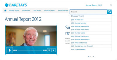
Barclays offers smart search tools
Search keywords allow for the most important or popular search terms to show instantly in a drop-down menu from the search box.
Some companies, such as the National Bank of Liechtenstein, are displaying the top 10 pages as links on the main page in their online annual report. These additions recognize the most viewed terms in the report and make the pages where they appear easily accessible.
4. Fast facts
Fast facts are being used quite widely to give a brief overview of a report, with links leading to more in-depth information. Key figures and developments of the year are presented in a summary.
This tool shows a development not only in design, but also in functionality, creating a simple platform for users in order to guide them to the section they require.
The tool ‘works well on mobile devices,’ comments Dominic Walters, Black Sun’s director of communication and digital strategy, as it allows the user to see ‘a snapshot of the annual report. It also addresses online users who scan for key information [before] deciding what to deep-dive into.’
Fast facts take pride of place in the Shell online annual report, with a link to this section on the first page you see. The report is whittled down to eight key pages, highlighting the main sections with clear and precise information and links to more detailed accounts, which consumers may wish to access.
Rosenmayr sees fast facts as ‘a good example of how to bring the main message upfront and thus offer the full, diversified and deep information via cross-linking just one click away.’ 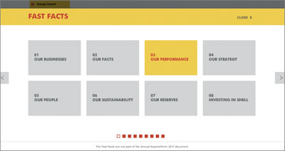
Eight fast facts from Shell’s 2012 report
5. Video
Not new to this year’s annual reports – but forever improving – is video. Previous years have shown many uses of video, be it launching automatically as the first port of call for the consumer, or a short summary film featuring the chief executive. This year companies have further innovated in their use of video.
One example can be found in the report from Hubbell, the manufacturer of electronic and electrical products, which uses an executive video to introduce its new leadership team to users as the sole online element of its report.
Agriculture co-operative Land O’Lakes has put online features at the forefront of its 2012 annual report, creating a range of narrative videos for different viewers classified as ‘customer’, ‘employer’ or ‘member’, and using social media to promote and link to the videos in its report. There is also the option of sharing the video via social media.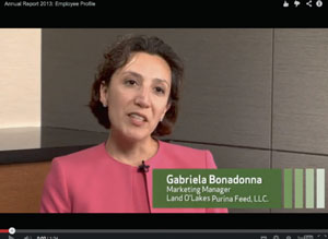
Land O’Lakes’ marketing manager Gabriela Bonadonna featured in a video aimed at employees
Land O’Lakes included QR codes in its printed report to lead readers to specific videos. The Fortune 500 company also took a more personal approach in getting clients interested in its video content by setting up a kiosk at its annual meeting where videos could be accessed.
Deserving of special mention is Stanley Black & Decker. Noted for its use of video in its past four years’ online reporting, this year the firm has taken a step further, embedding a video in the backdrop to the 2012 annual report. The short clip – with sound – plays on repeat in the background and shows the company’s ambition to lead the way in video content.
It should be noted that the use of video in online reporting is not solely driven by investor needs; Eisenman points to the developing audiences the annual report is actually aimed at.
Recently, companies have been using their annual reports as channels for recruiting new graduates. With the development of online reporting, tools such as video are essential in promoting the tone of a company to potential employees.
Reporting right Once considered something ‘nice to have’, the prominence and sophistication of online annual reporting is rapidly expanding, especially among America’s largest companies, according to Noah Butensky, chief operating officer at Curran & Connors. Once considered something ‘nice to have’, the prominence and sophistication of online annual reporting is rapidly expanding, especially among America’s largest companies, according to Noah Butensky, chief operating officer at Curran & Connors.Now, as more and more stakeholders actively seek out a company’s accomplishments and future vision in an online format, a number of best practices have emerged. The following are Butensky’s top three.
|


